
Friday, 17 December 2010
FRONT COVER

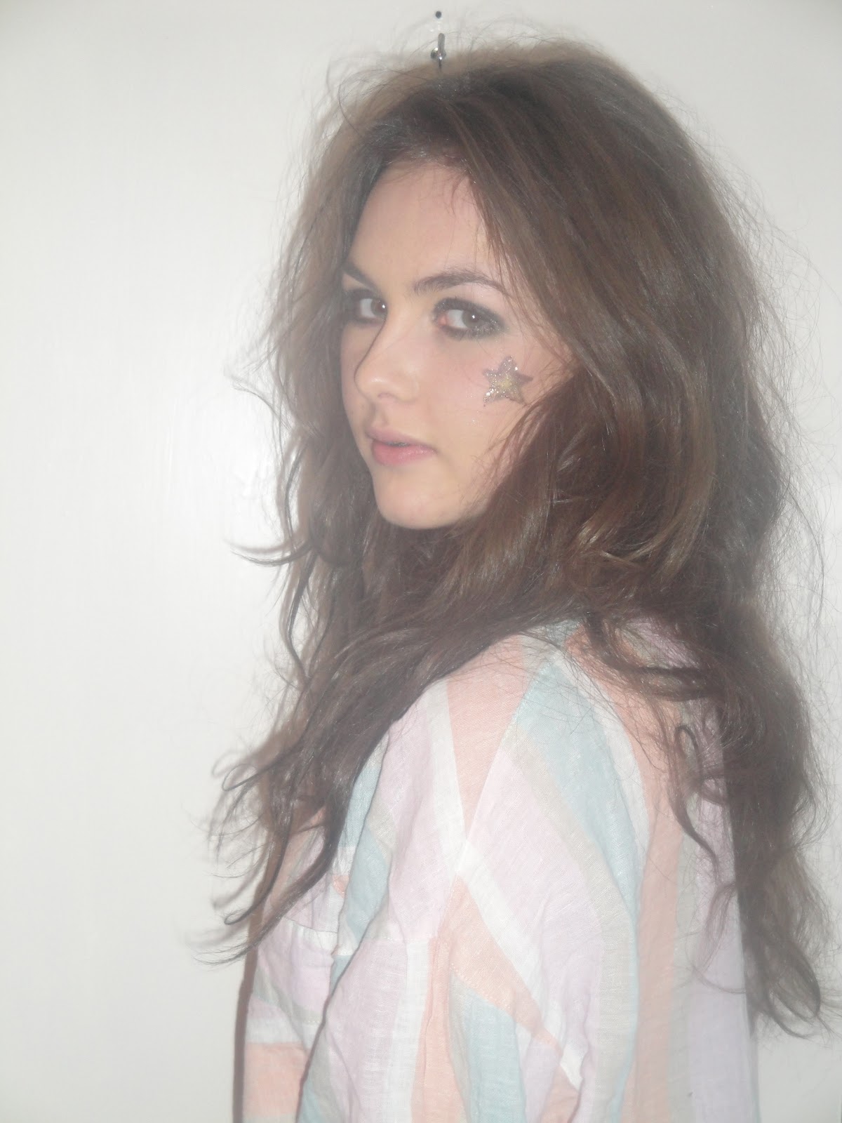
pictures i could use for my magazine :)


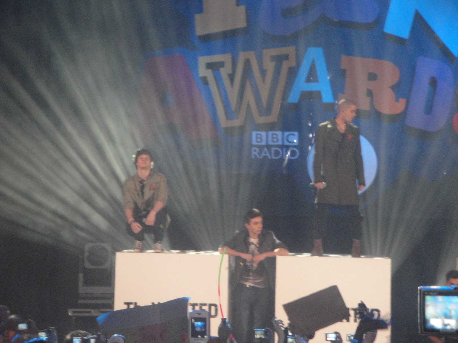


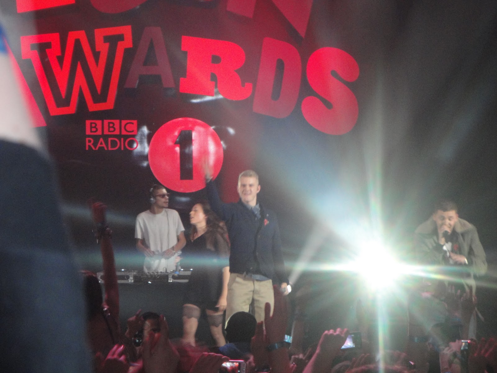
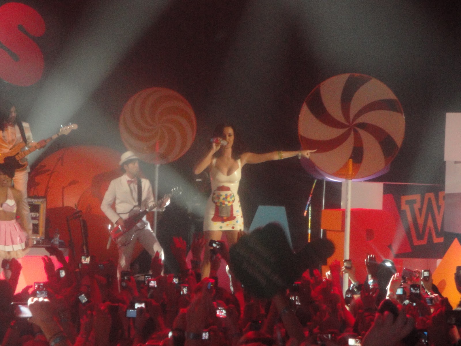


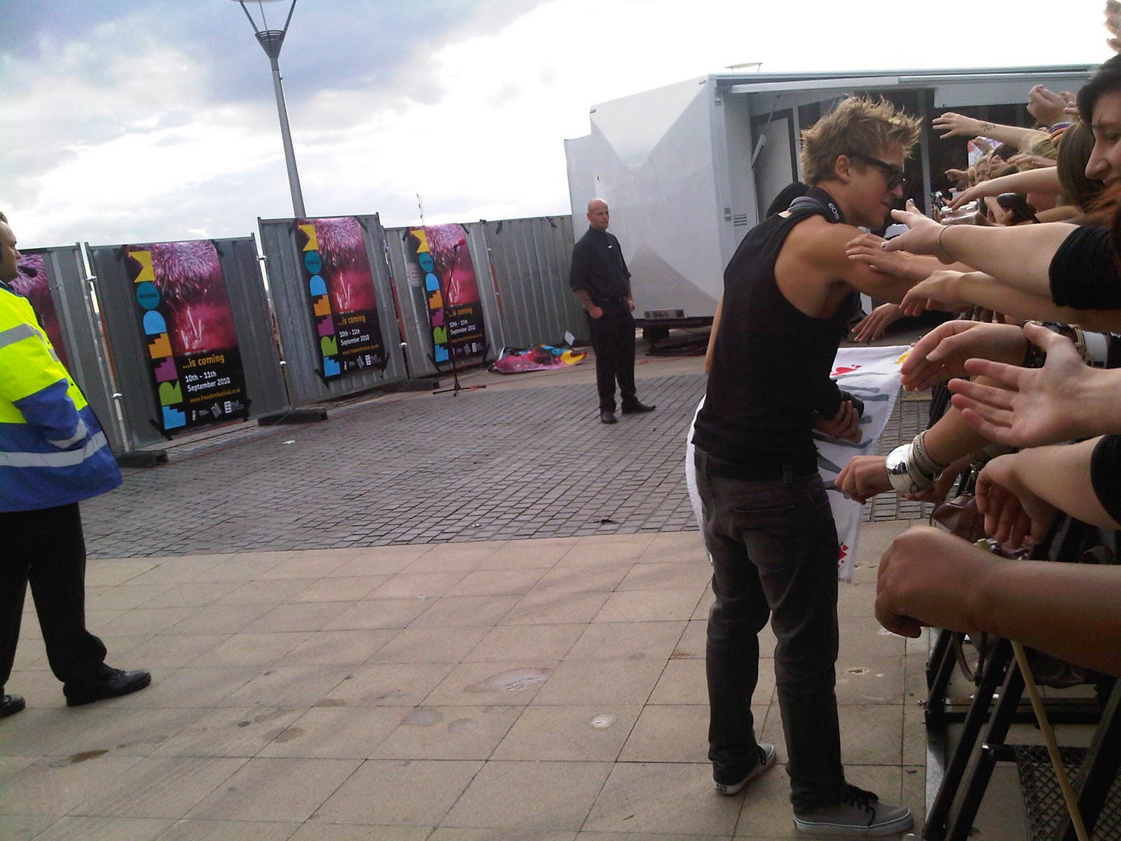
i could use some of the ones with me and a celeb in my double page spead to make it look as if i have interview the celebrity and the other images i have taken in the past month that i have found i could also use on the contents page and front cover.
pictures i was going to use


double page spead draft


the boxes in the top picture are going to be a collage of pictures of the band / artists with captions
ideas for the name of my magazine
i have decied to do a x factor style magazine and the names i have come up with are :
- love music
- heart music
- LM
- whats new
- hot hits
- HH

draft for the front cover

Monday, 29 November 2010
xfactor contents page
L- the contents page of the magazine has as 6 cover lines which each story fits under for example it has
I-
- 110%
- competitions
- features
- style file
- the final 50
- every week
I-
Tuesday, 23 November 2010
xfactor magazine front cover

L- the xfactor magazine is set out differently to a normal music magazine as it looks like gossip magazines suchas heat as the layout is more hectic and busy. the main photograph is composed in a way that fills the whole front cover showing a head and shoulder shot but more of a close up. the colours of the magazine are not conventional because they are bright in your face colours of red and pink which make you catch attention to it and also there are different types of font all over the magazine as it seperates each story as there is so much going on on the front cover and using black and white text infront of the pink gives impact to the person looking at the magazine.
I- this magazine is a large company as it is part of the talent show xfactor on itv and the show has millions of viewers each week this shows that the magazine will have alot of publisity.
I- the magazine has both music and chat magazine elements and also encourages people to follow there dream of music as the xfactor is a show that finds new talent.
A- the target audience for this magazine is teenagers as the front of the magazine looks quite childish but as you open the pages the content inside could be for adults too as it has alot of fashion and gossip in the magazine aswell.
R- the representation of the magazine is shown to the audience as pop as the colours and the way is is layed out is quite loud and in your face also they havent stuck to a simple layout and have overlapped pictures asif its a collage of images and text. it also uses the latest pop celebs on the cover to show they are up to date with the whats in the top 40 and are popular with the people of today.
magazines i am going to analyse
i am going to analyse 3 magazine front covers, contents pages and the double page spreads this will help me with my ideas of my own magazine. the 3 magazines i have chosen the analyse are :
xfactor magazine - because this is the only pop magazine i can find on the market at the moment
Q magazine - as it still has some pop genre in the magazine but cover more genres than just one.
kerrang magazine - even though this is out of the pop genre it will still show me the ideas the other types of magazines have to layout there cover, contents and double page.
Wednesday, 17 November 2010
music genre
the music magazine genre i have chosen is POP as there isnt any magazines out there that use this genre of music.
the only magazine that has just been released that uses the pop music is the xfactor magazine but this has only been around a couple of months this shows there is a market for pop music magazines.
the magazine feature that xfactor magazine has for the target audience is that they keep up to date with the latest pop star and who is number 1 as if there higher in the pop world at the time they are more likely to be on the front cover of the magazine the audience it usually buys pop magazines such as xfactor mag is usually teen girls.
keeping the pop magazine traditional and putting someone on the front cover that suites the pop genre will make it fit in and keeping the music inside the magazine new and fresh.
Thursday, 11 November 2010
music magazine brief
in my music magazine i need to include :-
- an original music magazine
- a front cover
- contents page
- double page spread
- 4 original images, no copyright
Friday, 22 October 2010
Short Evaluation
for this project i had to create a front page and a draft of a contents page for a magazine i chose to do a media magazine and show someone on a computer as the front cover image.
on my front cover of the magazine i used a medium close up image of a girl on a computer and the photo makes her stand out as i have blurred the background so you focus on what is impotant on the image. my front cover shows the girl working hard on a laptop showing that hard work = success and that she is concentrating on her work. the audience the magazine is aimed at is 16-19 year olds as thats general age people are at college and it is also made by a college student so this also reflects on the magazine.Finally the cover represents what media is like and having to work on laptops/computers and as the girl in the picture looks like she is concentrating and working hard shows the comitment to the media subject. the girl i used in the magazine had a blue top on so i carried the theme and used a darker blue as the title so first you look at what its called then the image all the subheading and headings are blue and black so they stand out ontop of the image.
in conclution i think my final piece went well and on time,the colours i used contrasted the image on the front cover and i followed the brief and included everything i needed to.
final piece front cover


barcodes.


these are the barcodes i created for my college magazine i used the name of my magazine to personalise the barcode so i wasnt just copy and pasting and already exsisting one.
i created these barcodes on http://www.barcodesinc.com/generator/index.php
final picture

Wednesday, 20 October 2010
name and fonts of my magazine
i chose the name media mag as it is short and snappy and is appropreate of all ages of the college and for genders. i decided to use the 7th font as it was simple and easy to read but these are the fonts i thought looked good
Media Mag
Media Mag
Media Mag
Media Mag
Media Mag
Media Mag
Media Mag
Media Mag
Media Mag
MEDIA MAG
Tuesday, 19 October 2010
front cover story line ideas
- media students take a trip to new york
- new media software available next week
- students deadlines
- secret visitor coming to our media classes
- top 5 media students of the week
- 10 ways to stay on track with work
- media media media
my pictures i have taken


these are the photos i took for my front cover when i first took the photo i took it landscape by mistake so i could use my first photo that i posted above when i realised i made sure all of the other images were portrait
compairing 2 college magazines -2

L- this college magazine also uses student life for the front cover of the magazine, the shot they have used is a medium close up and show the student dress quite trendy but holding books to show he is at college. he is wearing a black jacket and they have also used a black background which wouldn't usually work but they have put a grey glow around the image and also has yellow writing which stands out so it is separate from the background this also makes the image stand out and is the main focus of the front cover of the magazine.
I- this magazine is called college too and looks like it has been made by the students as its taking about the situation they face such as making money on campus and college couture.
I- the values and beliefs of the magazine is that the person is black on the cover which makes it more urban looking
A- the audience for the magazine would be the students of the college as it is aimed at them it shows confidence and acheivemant to the people looking at the magazine as is stood upright and is holding law books.
R- the representation of the magazine is to show the students what the collage lifestyle is about and by viewing someone on the front with law books shows he is educated and the friendly smile gives a good reputation on the students at the school lastly he is wearing trendy simple clothes which reflects on the fashion now.
Subscribe to:
Posts (Atom)